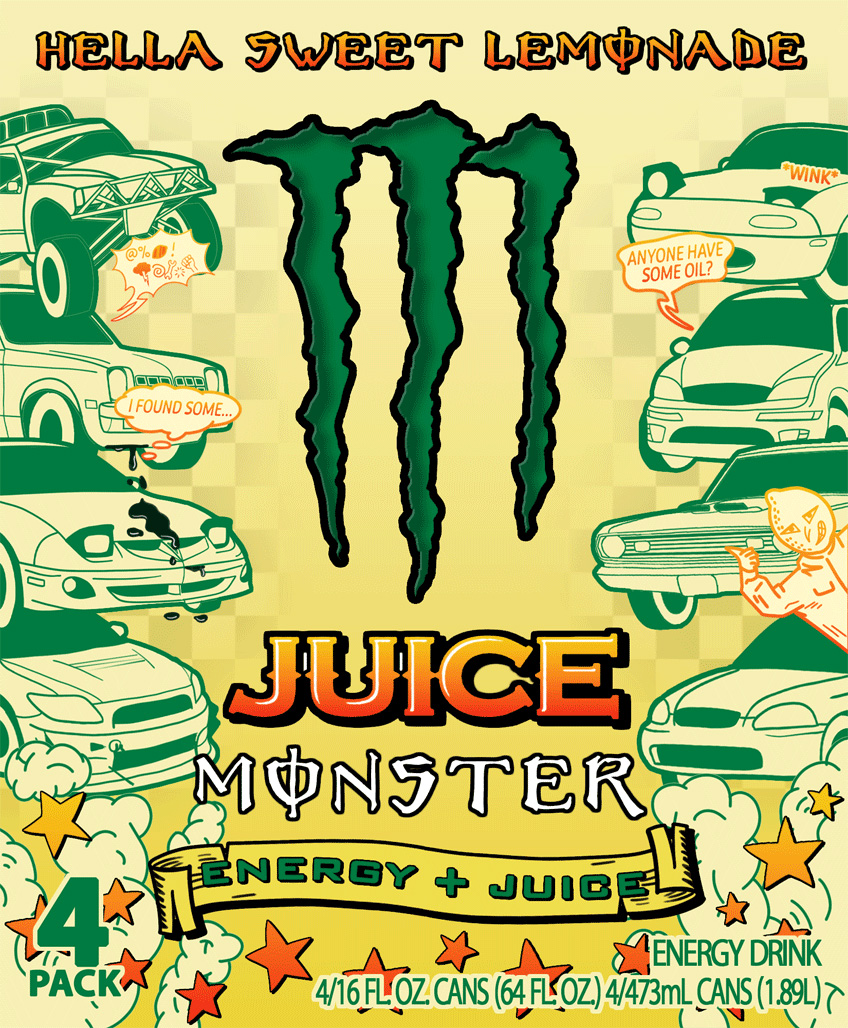
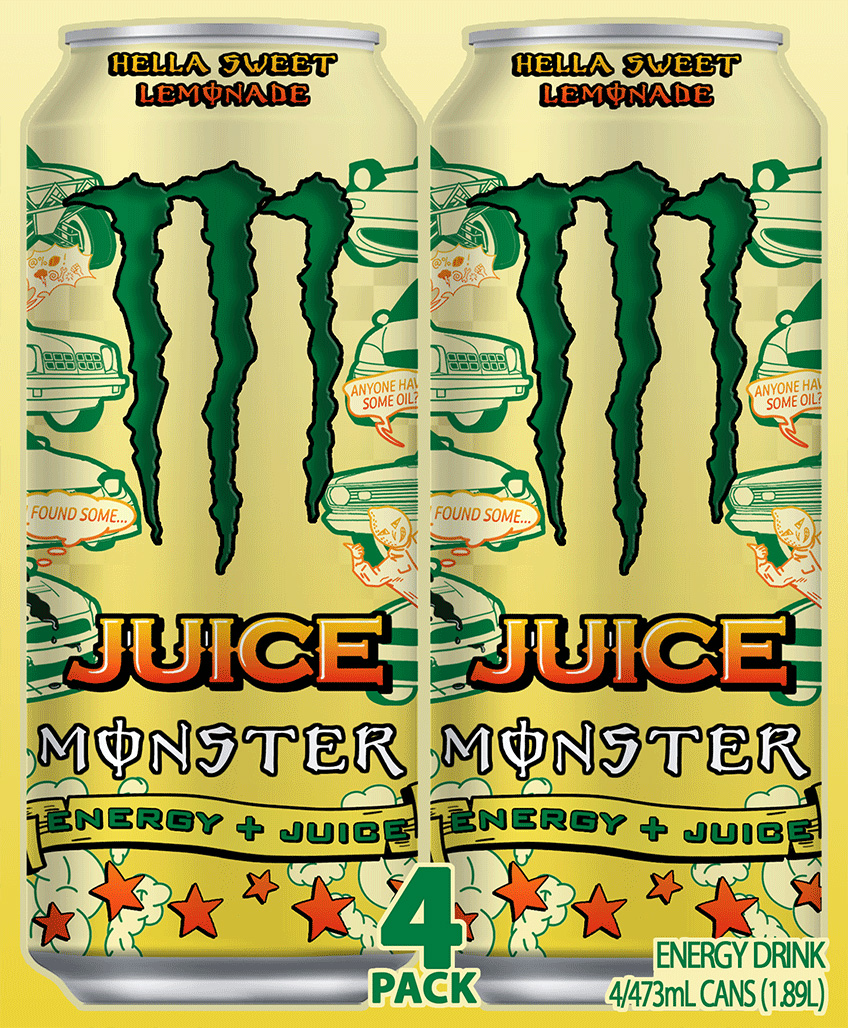
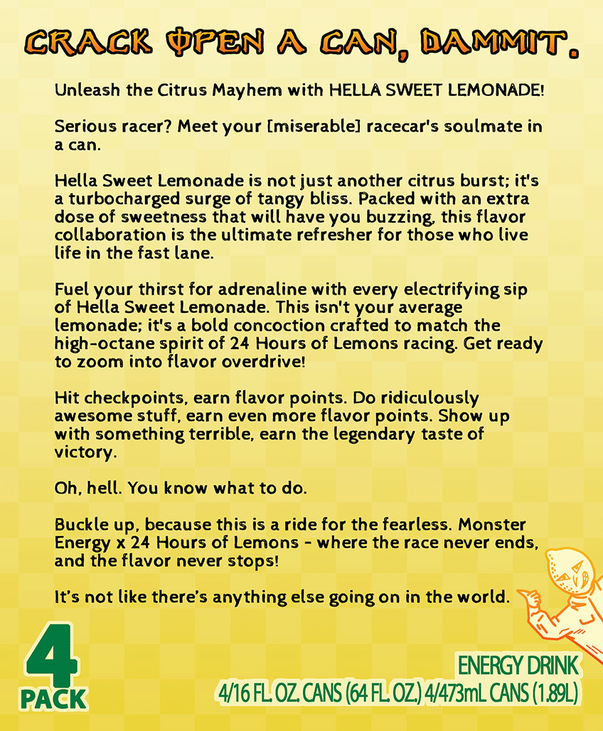
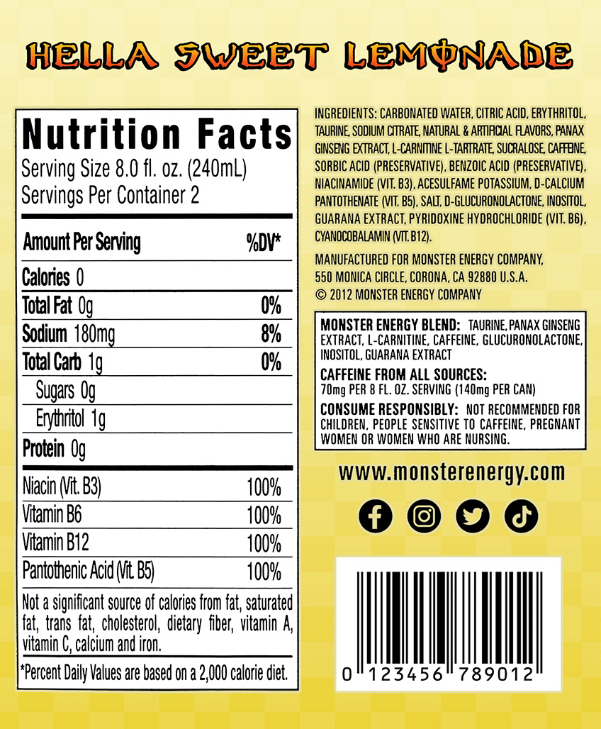
Monster Energy x 24 Hours of Lemons - POP Display
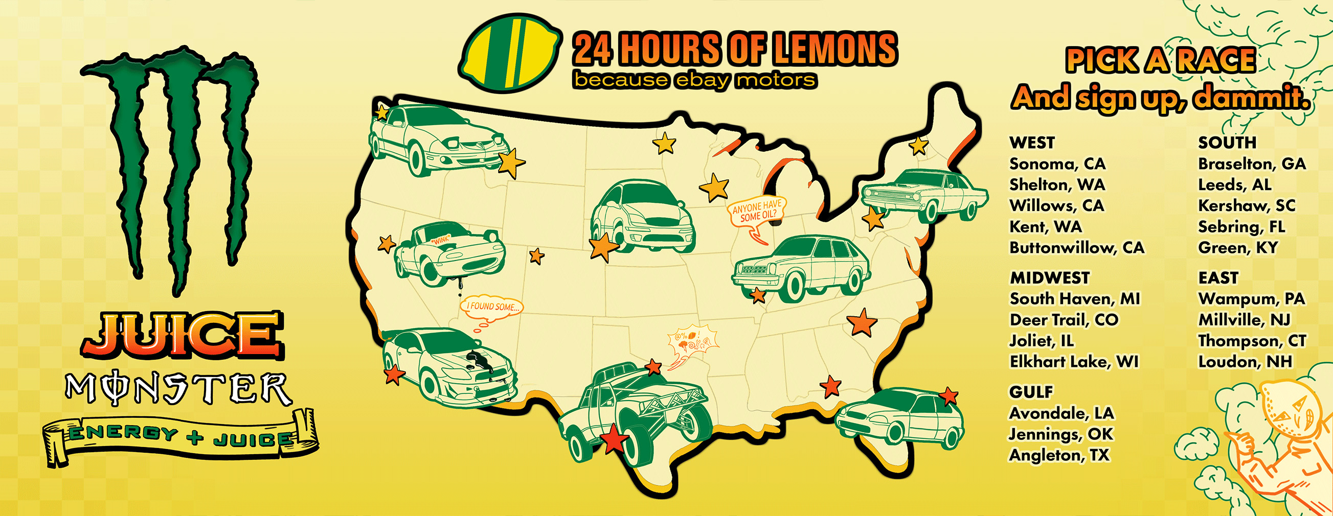
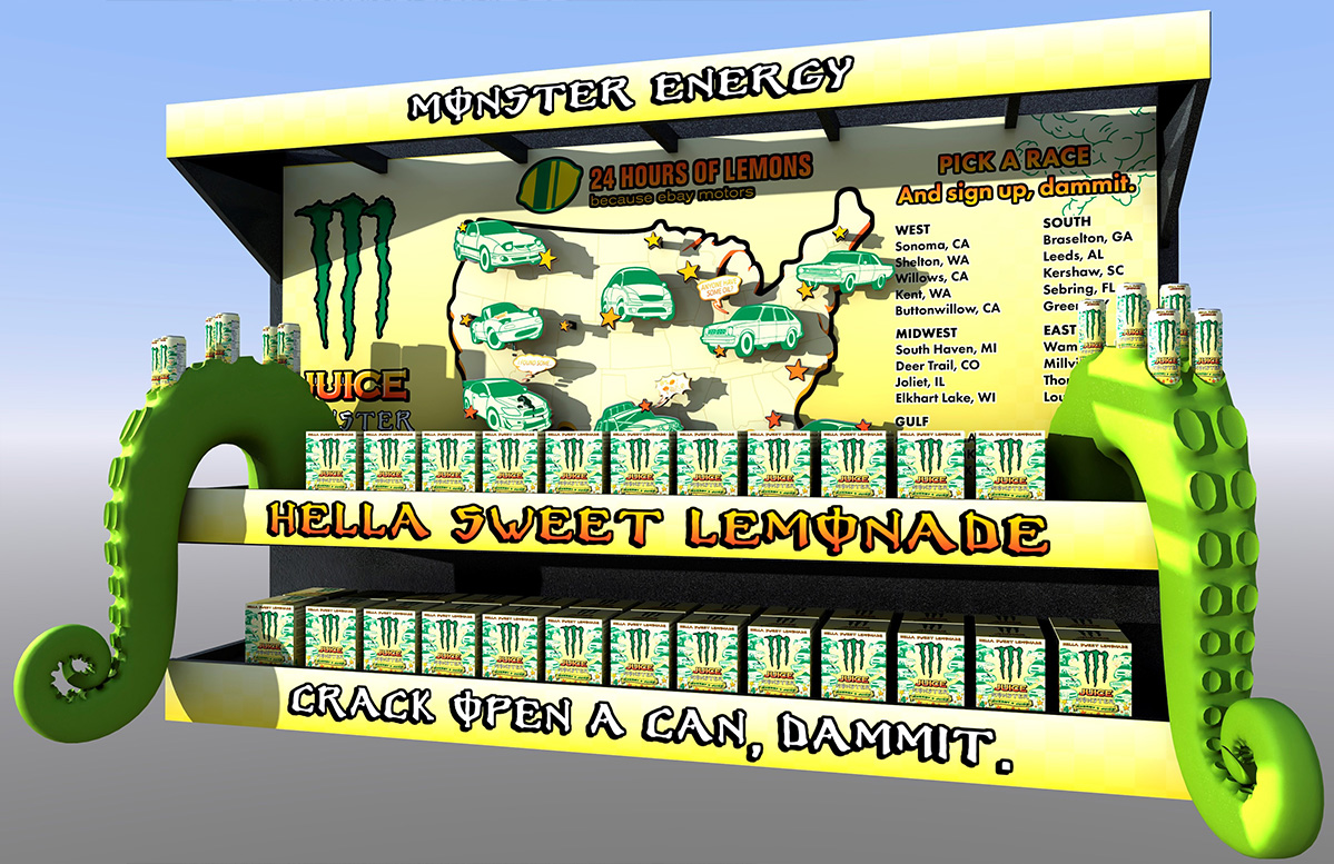
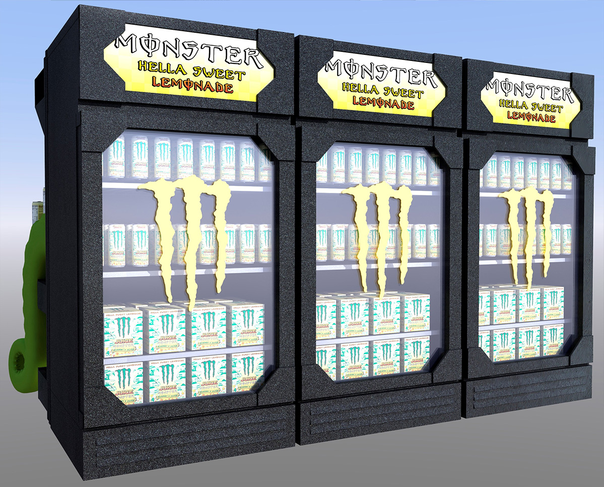
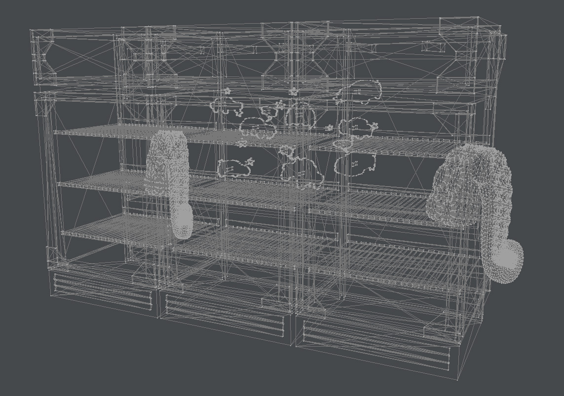
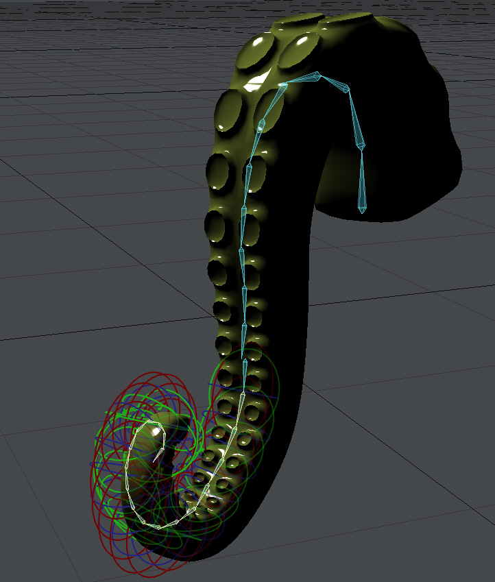
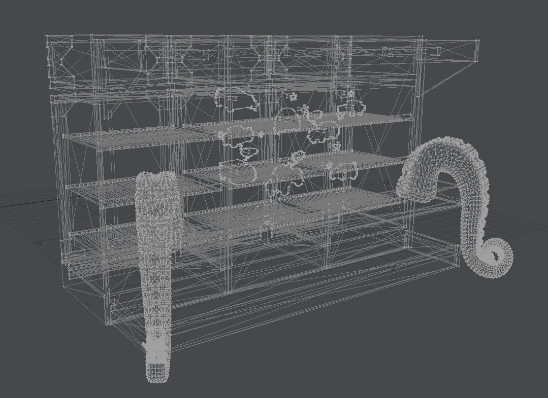
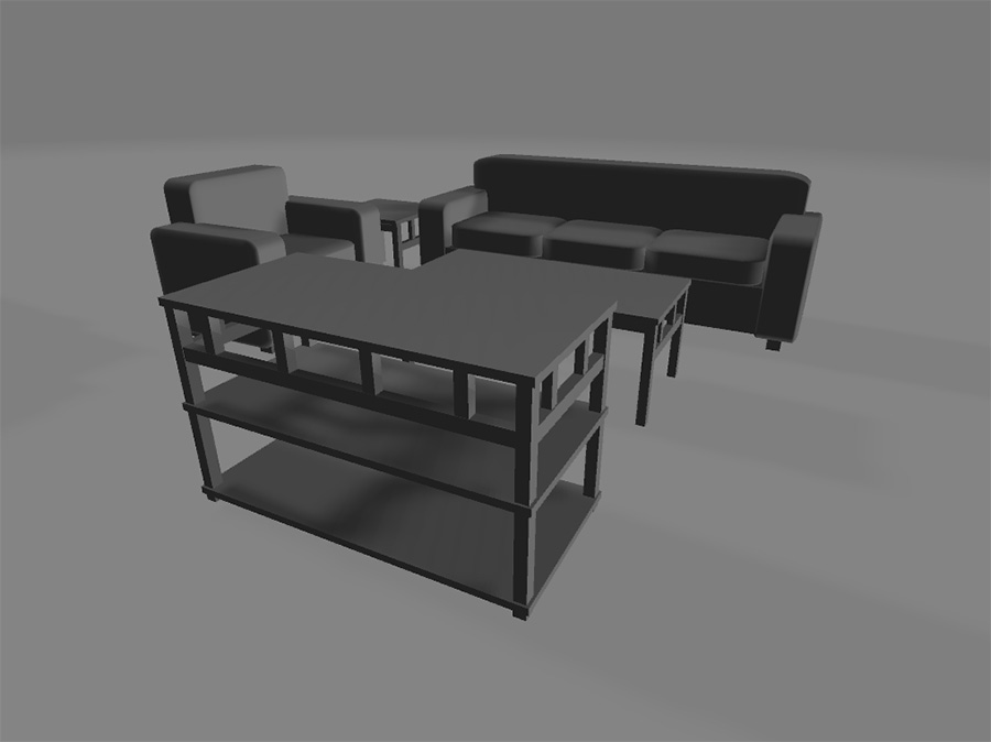
This point-of-purchase display was created during Steven's third year of college. The project challenged him to develop a retail display for an existing brand. Selecting Monster Energy, Steven sought to differentiate his work by proposing a collaboration with 24 Hours of Lemons, an amateur racing series featuring $500 cars. This strategic partnership connects Monster's established presence in motorsports with a grassroots racing culture. Steven utilized Photoshop for packaging and textures, while creating 3D models in Lightwave 3D and Blender, maintaining the distinctive visual identity of both brands throughout the project.
IUP: Residential Revival (Concept) - Coffee Table Book
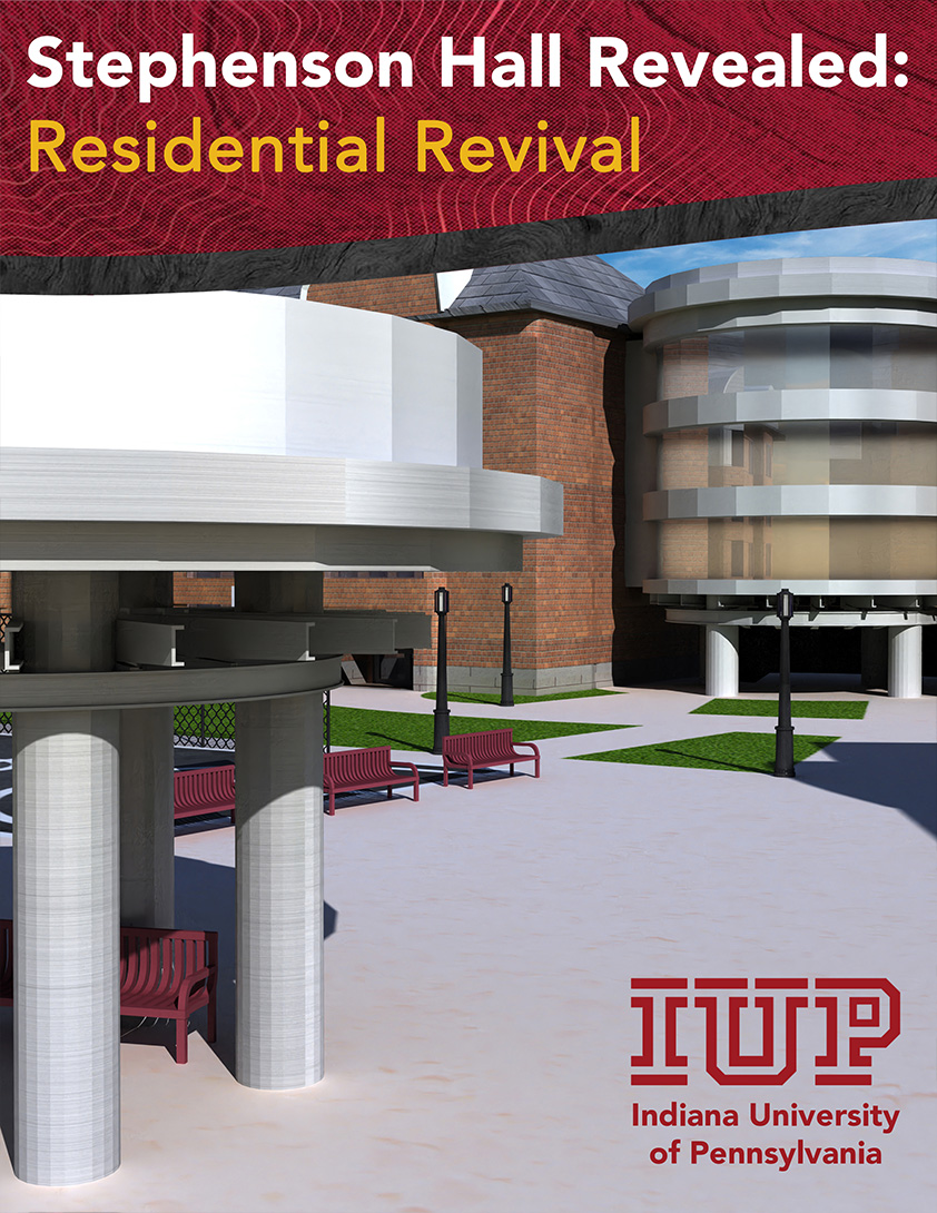
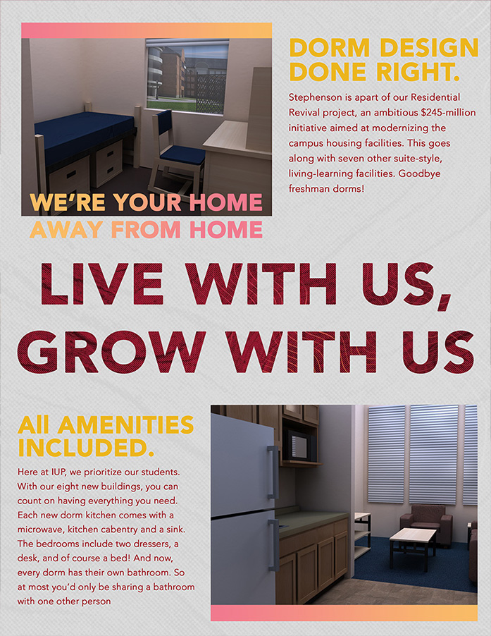
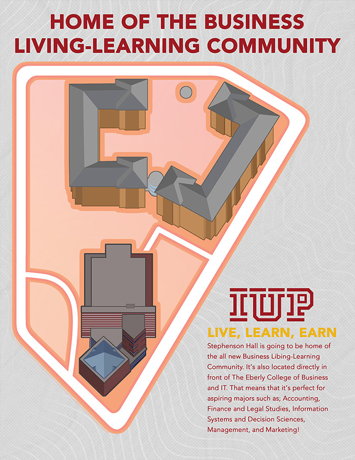
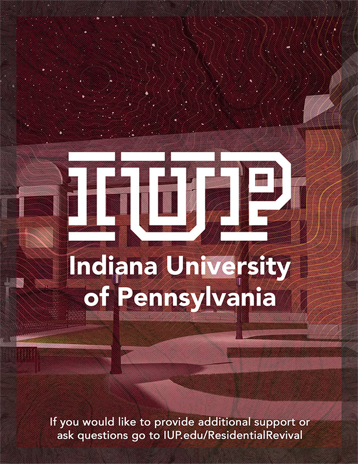
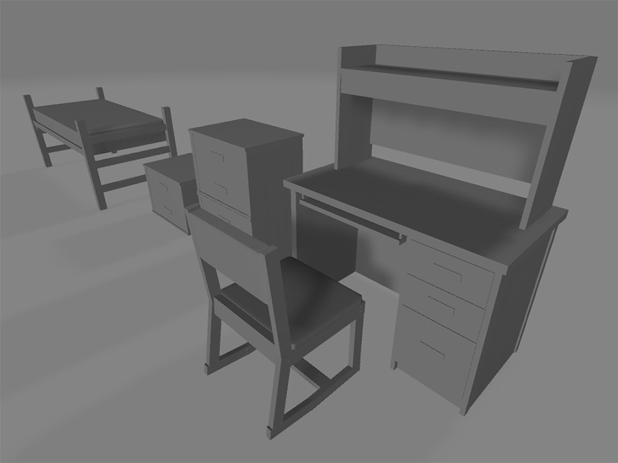
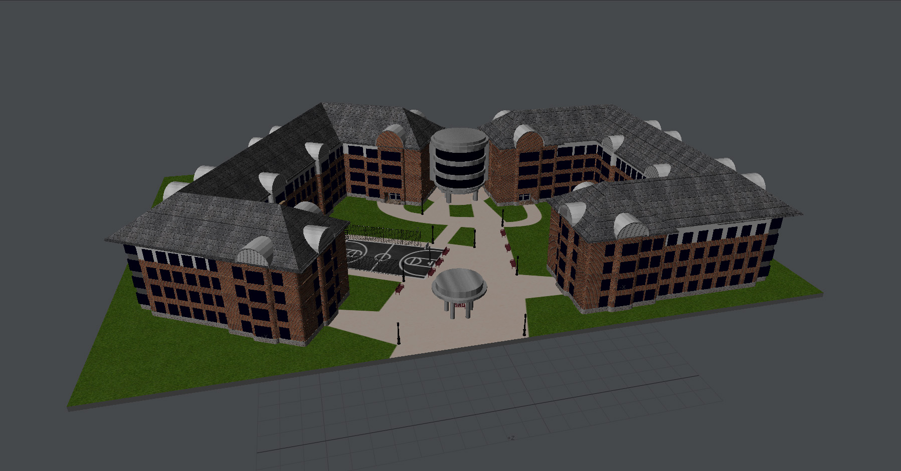
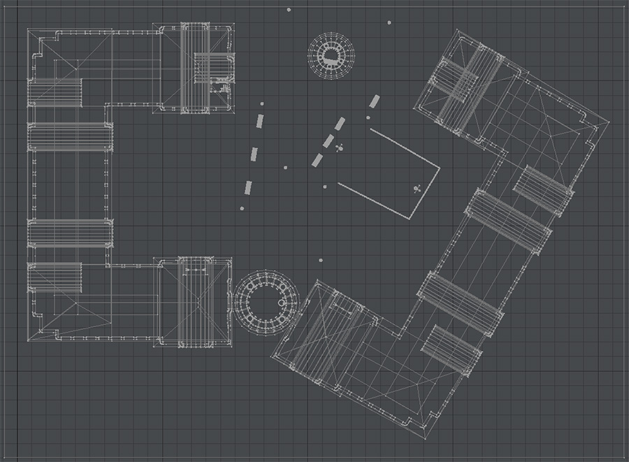
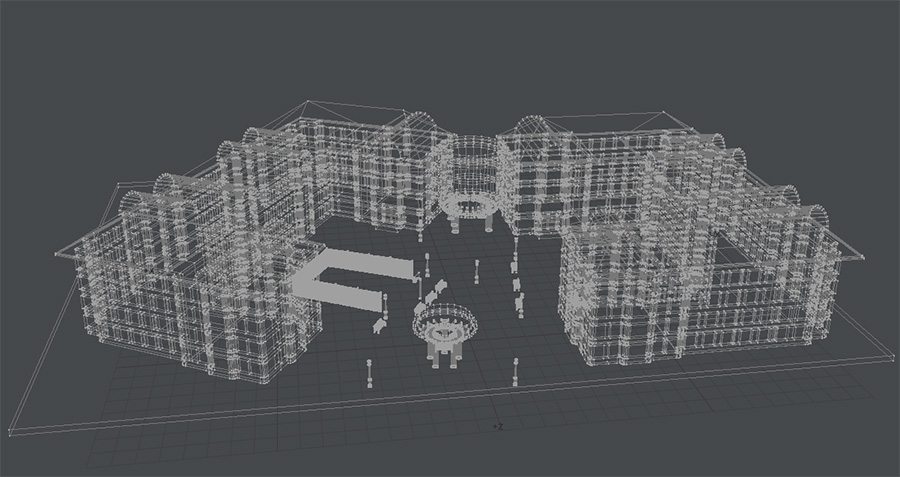
For this third-year project, Steven developed a coffee table book featuring 3D architectural renders created in Lightwave 3D. His concept centered on IUP's "Residential Revival" initiative, which transformed campus housing between 2004-2010. Steven chose to highlight Stephenson Hall due to its distinctive architecture and central "Hawk's Nest" feature. The booklet, designed in IUP's contemporary visual style, presents a forward-looking vision of student housing. Steven envisioned these displays in residence hall lobbies to showcase the student experience to prospective residents. The project combined 3D modeling in Lightwave 3D and Blender with layout design in Photoshop and Illustrator.
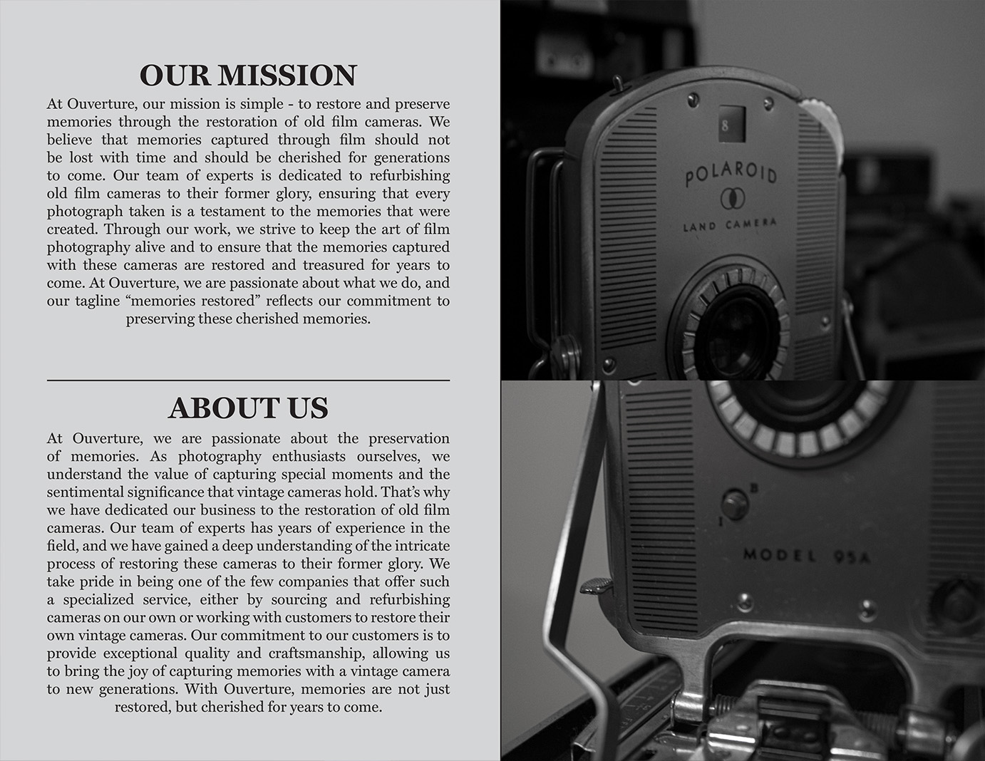
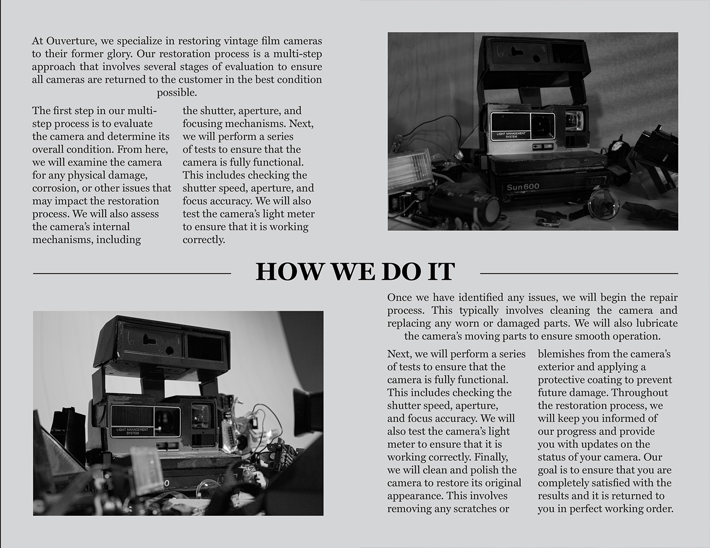
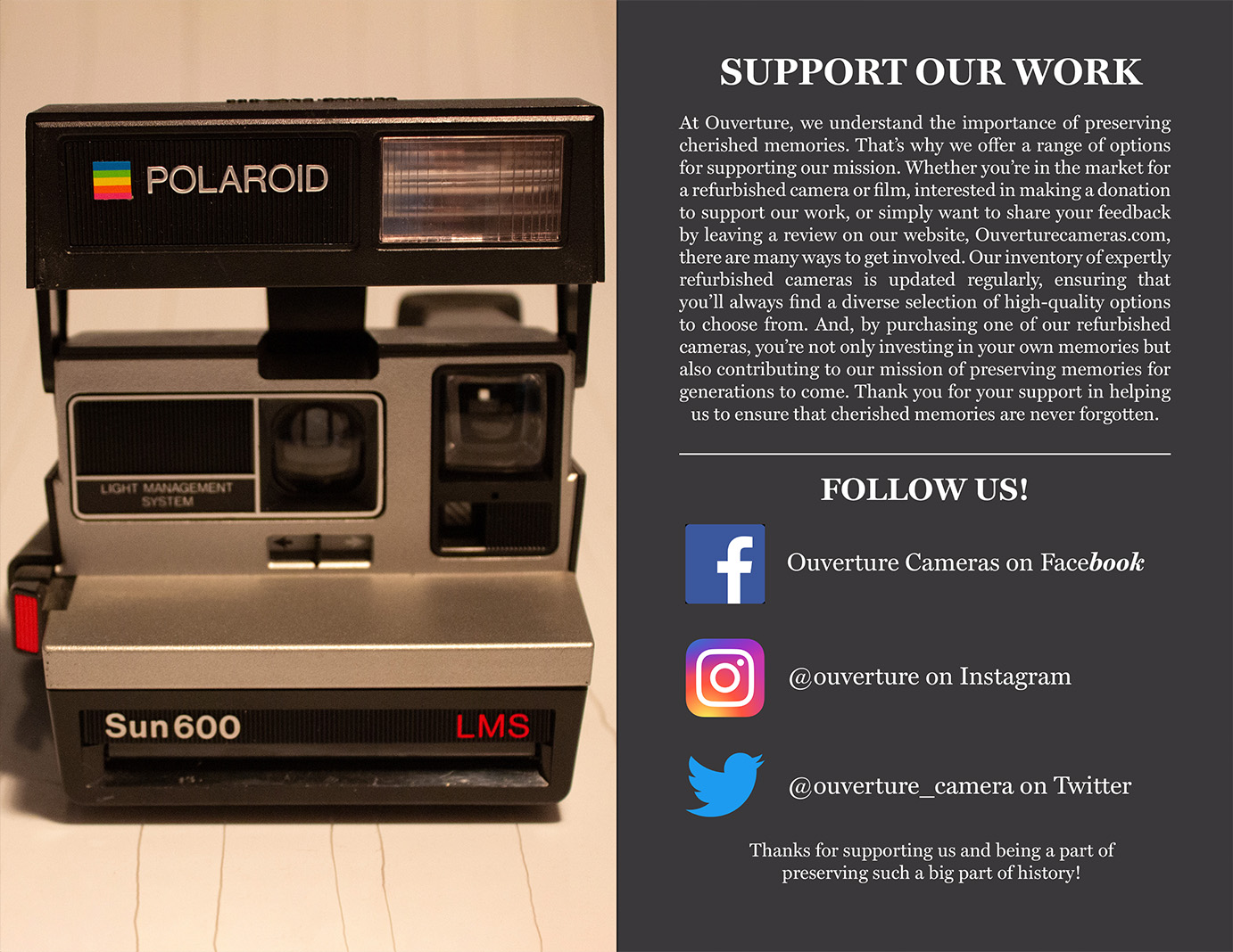
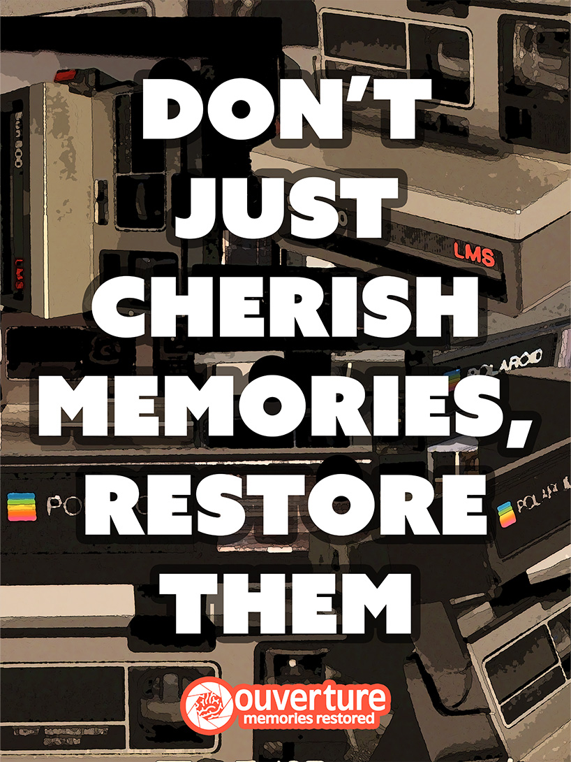
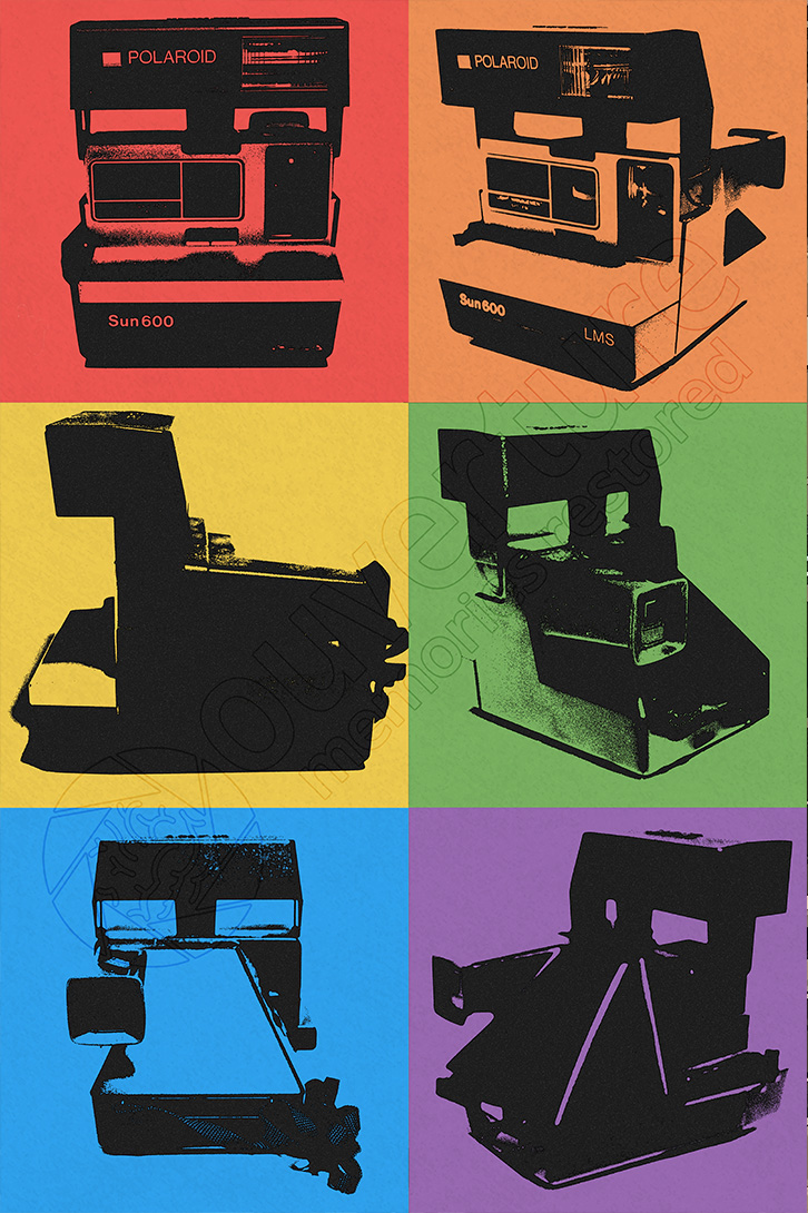
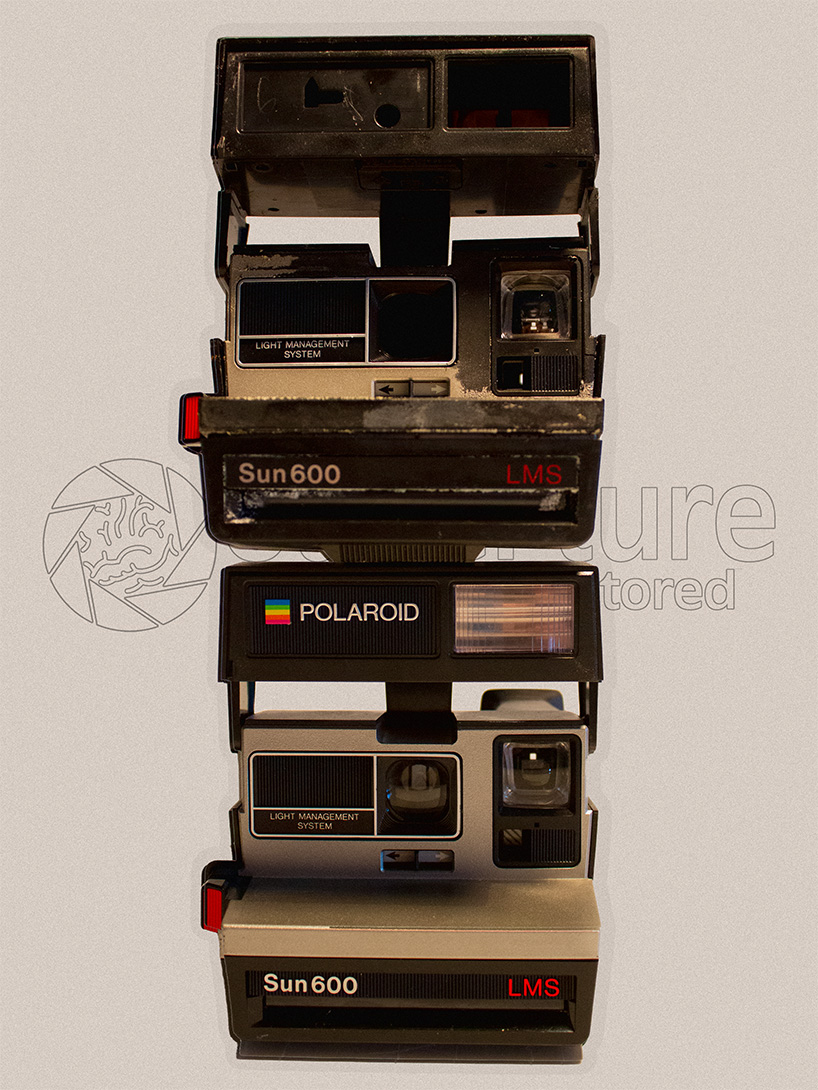
Ouverture: Memories Restored - Branding Project
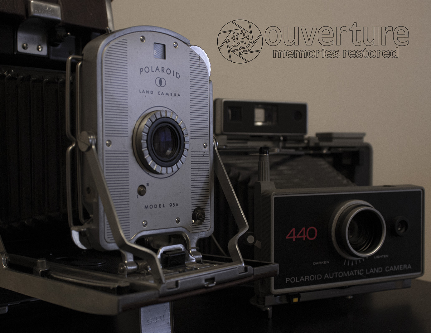
This comprehensive branding project from Steven's second year of college demonstrates his application of the Golden Circle methodology, prioritizing "why" before addressing "how" and "what." Ouverture's brand mission centers on preserving vintage film cameras as historical artifacts, paralleling the preservation of personal memories. The deliverables included a product catalog designed in InDesign and three promotional posters created in Photoshop, collectively articulating the brand's purpose and identity in the photography preservation market.
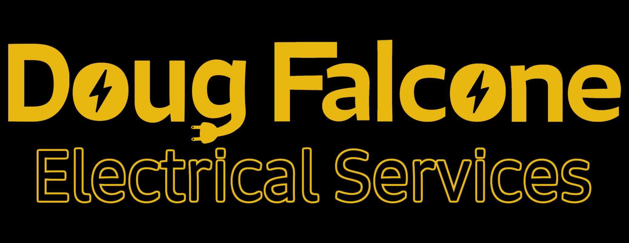
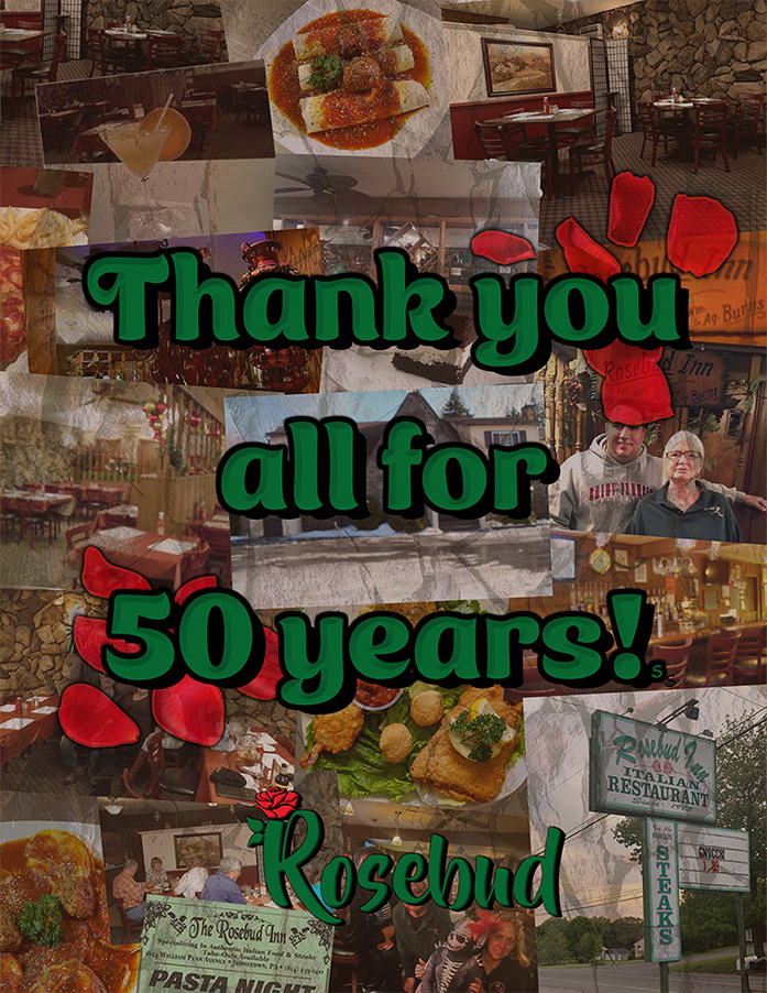
Small Business
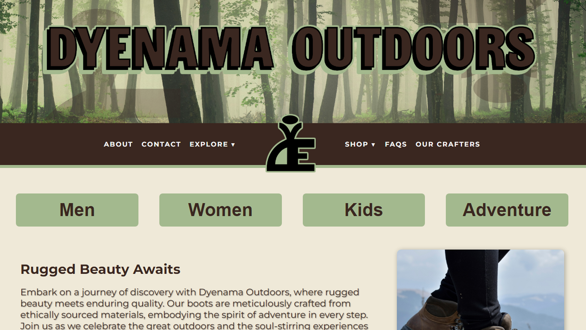
Steven's portfolio includes design work for local small businesses that demonstrates his appreciation for independent entrepreneurship. These projects offer a contrast to his work with established brands, allowing Steven to support fellow business owners pursuing their passions. He values these opportunities to connect with community-based enterprises and contribute to local business development while balancing commercial demands with authentic brand identities.

.jpg)

Conemaugh Valley High School
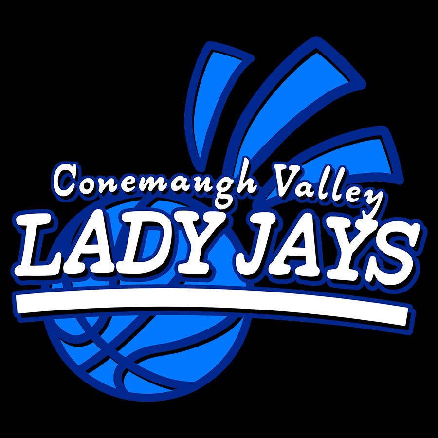
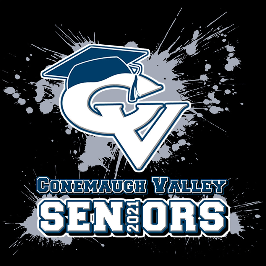
Prior to his college education, Steven produced various design projects for his high school using Photoshop. These assignments ranged from T-shirt designs and logos to a gymnasium floor graphic. Attending a small high school provided Steven with valuable opportunities to create materials that were implemented by the institution, building his portfolio and providing practical experience that informed his decision to pursue graphic design at the collegiate level.


.jpg)

Monster Energy x 24 Hours of Lemons - POP Display
This point-of-purchase display was created during Steven's third year of college. The project challenged him to develop a retail display for an existing brand. Selecting Monster Energy, Steven sought to differentiate his work by proposing a collaboration with 24 Hours of Lemons, an amateur racing series featuring $500 cars. This strategic partnership connects Monster's established presence in motorsports with a grassroots racing culture. Steven utilized Photoshop for packaging and textures, while creating 3D models in Lightwave 3D and Blender, maintaining the distinctive visual identity of both brands throughout the project.


IUP: Residential Revival (Concept) - Coffee Table Book
For this third-year project, Steven developed a coffee table book featuring 3D architectural renders created in Lightwave 3D. His concept centered on IUP's "Residential Revival" initiative, which transformed campus housing between 2004-2010. Steven chose to highlight Stephenson Hall due to its distinctive architecture and central "Hawk's Nest" feature. The booklet, designed in IUP's contemporary visual style, presents a forward-looking vision of student housing. Steven envisioned these displays in residence hall lobbies to showcase the student experience to prospective residents. The project combined 3D modeling in Lightwave 3D and Blender with layout design in Photoshop and Illustrator.


Ouverture: Memories Restored - Branding Project
This comprehensive branding project from Steven's second year of college demonstrates his application of the Golden Circle methodology, prioritizing "why" before addressing "how" and "what." Ouverture's brand mission centers on preserving vintage film cameras as historical artifacts, paralleling the preservation of personal memories. The deliverables included a product catalog designed in InDesign and three promotional posters created in Photoshop, collectively articulating the brand's purpose and identity in the photography preservation market.


Small Business
Steven's portfolio includes design work for local small businesses that demonstrates his appreciation for independent entrepreneurship. These projects offer a contrast to his work with established brands, allowing Steven to support fellow business owners pursuing their passions. He values these opportunities to connect with community-based enterprises and contribute to local business development while balancing commercial demands with authentic brand identities.

.jpg)


Conemaugh Valley High School
Prior to his college education, Steven produced various design projects for his high school using Photoshop. These assignments ranged from T-shirt designs and logos to a gymnasium floor graphic. Attending a small high school provided Steven with valuable opportunities to create materials that were implemented by the institution, building his portfolio and providing practical experience that informed his decision to pursue graphic design at the collegiate level.


.jpg)
